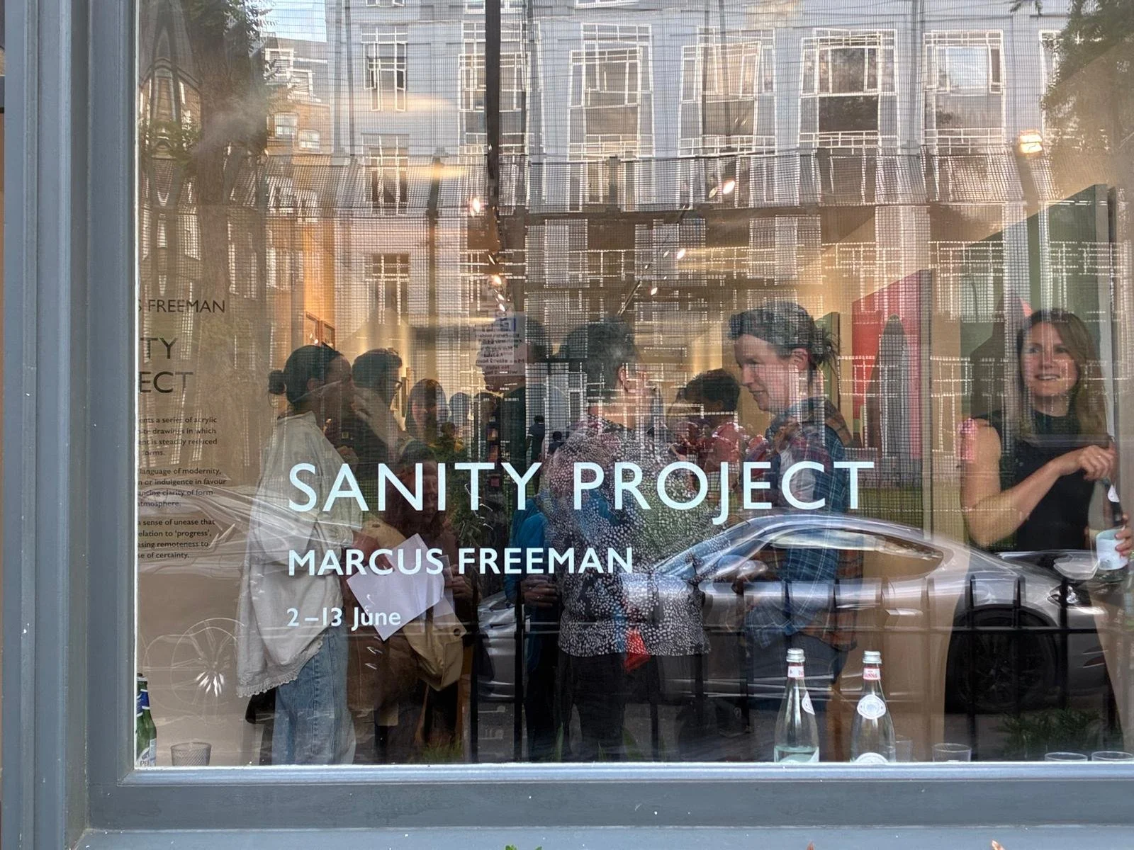
This is really just to thank all the people who braved heavy skies and dodgy trains to join me at the opening of Sanity Project at Fitzrovia Gallery, on Thursday 4 June 2026. It was lovely to see everyone and see the space filled (and the Grafton Arms around the corner afterwards, which has a great little roof garden). Thank you to Martina at Fitzrovia for looking after the space and facilities, to Ben and Zak for helping me install and hang the work and to Jess for helping me plan the whole thing.


Sanity Project
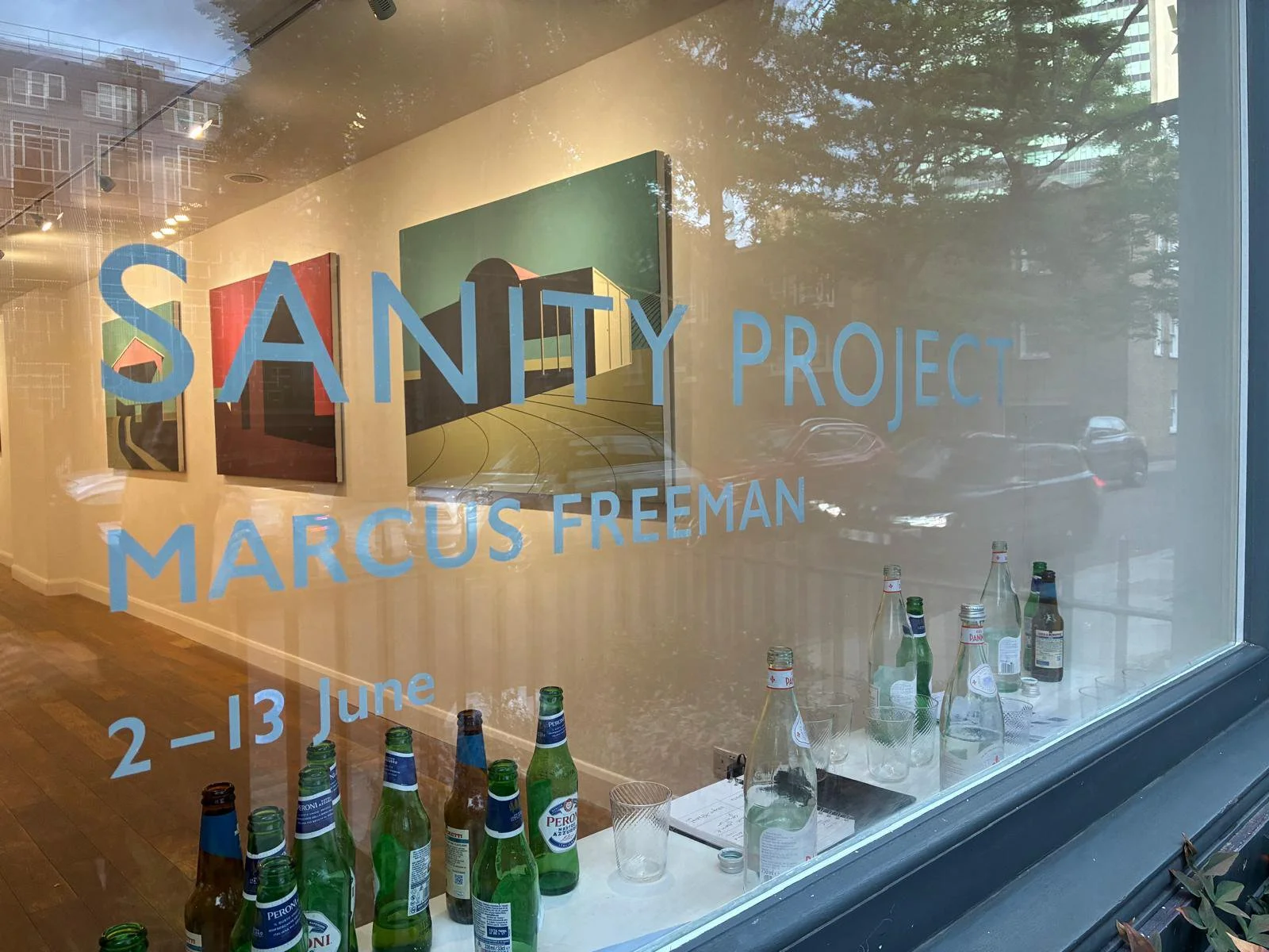
This is the text that accompanies Sanity Project, my recent exhibition at Fitzrovia Gallery London.
Marcus Freeman’s work is principally acrylic paintings of buildings, or ‘urban landscapes’ as he prefers to think of them: ‘I always think of myself as a landscape painter, but we are not a rural society anymore’. Freeman’s subjects are rendered with graphic clarity in broad slabs of colour that emphasise and transcend their often unremarkable utilitarian nature. Characterised by long shadows – cast as if by a nuclear flash – his scenes offer a stark account of these fundamentally human-made forms; the cuboid is mankind’s building block (and, perhaps, a distinctly male one).
In part, the work treats these basic volumes, and their pitched roofs, purely formally. Aesthetically, they are exercises in breaking up the picture plane, in drawing the viewer in through their three-dimensional weight; their ‘basic mass’ clearly holds enormous appeal for the artist, with only the occasional curve or plough line allowed to break the tension. Yet their pitiless depiction also lends them a peculiar sorrow. The isolated forms appear thrust from the parched ground like tombstones or forgotten monuments, but with none of the romance of ruin. The only texture or patina offered is that inherent in the materials themselves: the weave of the canvas, the subtle ridge where two blocks of colour meet. Nothing is allowed to charm or distract that is not intrinsic to the form or to the discipline of the chosen medium.
This contrast – between a distinctly twentieth-century language of ‘progress’ and an atmosphere poised between emptiness and dread – captures something widely felt about our current direction of travel, and our dwindling faith yet continued investment in everything from institutions to our increasingly urban or digital modes of existence. ‘Remote’ in a sense far removed from our near-forgotten pastoral way of life.
The graphite drawings included in this exhibition extend these concerns to a broader and more eclectic range of subjects. Where the paintings refuse incident, the graphite allows it to emerge, its tonal variations introducing a patina otherwise absent in his paintings. In this sense, the paintings deny time, while the drawings cautiously reintroduce it. In dragging the graphite over the paper with different intensities, Freeman arrives at effects that are inherently unpredictable yet still resist decoration or the indulgence of the particular over the general or archetype.
Paysage
There are not many Picasso landscapes, which is a great shame. However, this rather wonderful example seems atypical in another way: as its accompanying text at the Artison Museum Tokyo notes, it is idealised and lyrical like a stage set; but it also exuding something close to warmth or affection, from an artist often cited for his detached coolness towards his subjects.
I would dearly love to see the view it was based on, but with the title simply Paysage, I think that is unlikely unless I should happen upon a Picasso scholar.
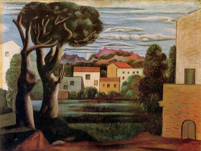
Pablo Picasso 1919, Paysage (Landscape with Dead and Live Trees)
In passing
I often pass the Church of St. Andrew the Less. Its built on the site of Barnwell Priory, the scant remains of which pepper the surrounding residential streets. The building might be of some historic interest, but is not in use and faces an uncertain future. In winter the pollarded trees stand like sentinels of sadness against its drab facade of rubble walls blackened by coal dust.
The church’s location by a busy road means it’s most likely glimpsed from a passing car; and for anyone on foot it’s equally difficult to appreciate from the pavement as four lanes of traffic belch past. Still, as I am never much drawn to the picturesque for inspiration, it has a certain formal wholeness and an emotional evenness of tone I could not let pass.
St. Andrew the Less Marcus Freeman
After Kiyoshi Saito
This image came to me in a dream, or rather I pictured it while half-awake. I don’t think I am very good at picturing things ‘in my mind’s eye’, but in a half-waking state, occasionally fully-formed images appear, fleetingly. Apparently, you can train this part of your conscious-dreaming mind, but more on that later. I can only imagine with envy whether for others this ability is available on-demand in their waking hours.
It wasn’t intentional, but I realised my rendering of the image – faithful except for a patch of blue sky top left that I could find no way to delineate successfully – looks very much in the manner of a Kiyoshi Saito print. In a way I ‘found’ it, so I am posting it here as ‘dream ephemera‘.
Coppice Marcus Freeman
Kiyoshi Saito
Having accused elements of both Eric Ravillious and Paul Nash of being 'unresolved’, I thought I’d better expand. I suppose it means a problem solved rather than a problem explored. It’s a kind of mastery – akin to what musicians call evenness of tone - the particular limits of which are dictated entirely by the work in question.
It’s an overwhelming sense of pictorial completion that is immensely seductive yet might very well come at the expense of ambition; and can easily lapse into style. In any case, great technique is often suited to only a limited range of subject matter; whereas genuine enquiry is unembarrassed by falling short and therefore – in theory – without such constraint.
Achieving such a sense of resolution in one image does not necessarily promise any wider mastery of image making. In this respect, for example, there’s only one good Ed Ruscha. There are many one hit wonders, (and plenty of artists utterly uninterested in producing a hit).
These woodblock prints by Kiyoshi Saito are brilliantly resolved. They happen have a simple graphic sensibility about them, but that’s not a prerequisite.

Woodcuts with snow
Its a shame we have such mild winters as snow is such a relief to an image-maker with a strong graphic sensibility; transforming the familiar over night, masking awkward details and creating free-ranging negative space.
The first of these is by Kiyoshi Saito (who will feature in another post) but I’m afraid I have lost the sources for the other two, but they show you don’t need to be an acknowledged master to benefit from a white out.


Stopped Clock
As further proof of the above, I don’t like Walter Joseph Phillips’ woodcuts, except for this one, which I love. So even a stopped clock…

Paul Nash
I keep coming back to this picture by Paul Nash as it represents a fascinating paradox to me. Despite being singularly unresolved, stiff and unnatural in manner and - to coin a modern phrase - pretty ‘basic’; it is one of my favourite landscapes and a continuing source of inspiration. Perhaps we simply don’t find perfection very instructive.
The painting hangs in the Ferens Art Gallery in Hull, but was once featured on a poster for Shell. Innocent times of course, but what a brave intersection between art and commerce. No ‘revisions’ I imagine.


Faro Island
I think print of mine compliments the above post.
Incidentally, the sea wall was about a foot high, but I couldn’t find a device to properly illustrate the scale; so everything’s ended up looking a little out of whack. More resolved than the Nash, but not as good. And no client as yet.

Sino-Japanese War


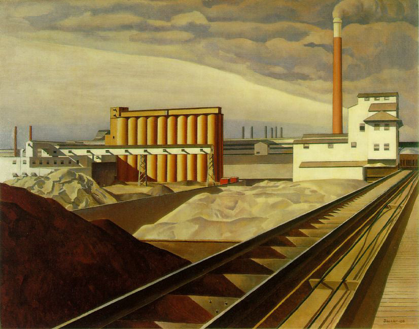
Charles Sheeler
What to write about these Charles Sheeler paintings that remain touchstones of perfection for me. I am blind to their limitations, so I cannot expand on those. It’s difficult for me to imagine someone would not enjoy looking at these, yet I know intellectually that must be the case for some of people. Despite all the truisms (beauty is in the eye of the beholder ad nauseum) it takes great intellectual effort to credit for any length of time the knowledge we are not making absolute judgments. We simply find as we see.

Fire
It’s generally accepted that painting (little known etching) doesn’t do action well, and that’s certainly one of the reasons fine art’s visual domination waned as the world sped up. Most examples of artworks featuring flames only emphasise this, the difficulty of capturing that most elusive and fleeting of natural phenomena makes even studies of shifting clouds seem straight forward. Yet, sometimes, as in the below example by Pugin and Rowlandson, the attempt is so wrought with effort – such a clear manifestation of hope over expectation – that we are drawn to the failed heroism evident in the result.
As an aside, it’s odd that in the works of the Futurists – who in their very conscious attempts to capture action arguably failed just as comprehensively – the results tend to exude the hubris of overbearing confidence rather than the charm of human limitations.

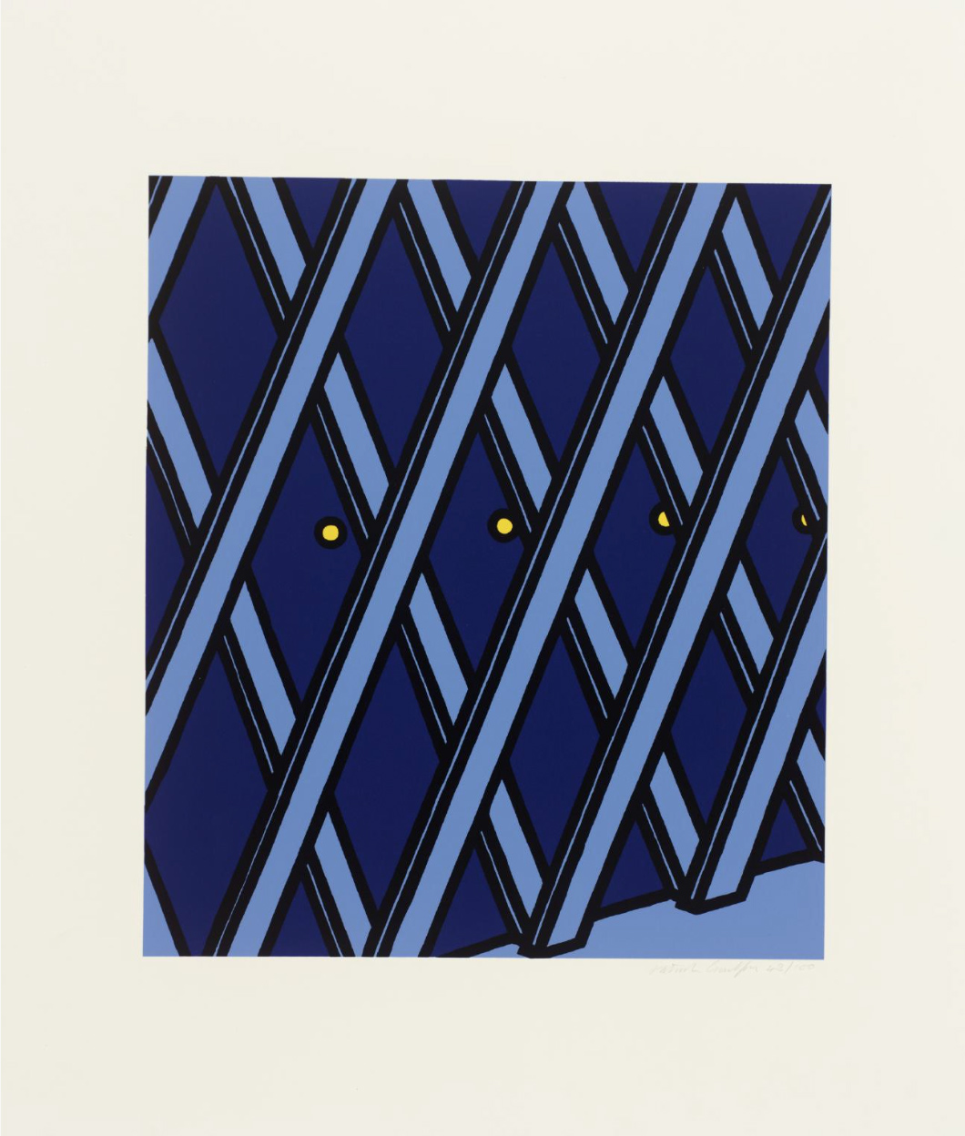
Patrick Caulfield
I'll take my life monotonous. I don't think anyone can match Caulfield for economy and atmosphere. I think this is the most evocative of his Jules Laforgue prints, and the only one that is really a landscape. Its also the only one I own.
Edward Bawden’s house
A perfect studio. See Edward Bawden's house in Saffron Walden as it was shortly after his death in 1989 link.

Russo-Japanese War
Incredible wood block prints of the Naval battles between two emergent empires on the other side of the world at the dawn of the 19th Century.


Not Hitchcock
But stills from a particularly vivid episode of Thomas the Tank Engine. Get it where you can.


Exhibition
I would have loved to have caught this, if it hadn't been four decades before my birth (and in Illinois).

Eric Ravilious
These two watercolours are positively heady with atmosphere. I've heard Ravillious's work described as 'almost supernaturally beautiful’; but at the same time it avoids most of the conventional devices associated with beauty and retains a certain charming – near amateur – awkwardness. Mind you, so did Cezanne (although I'd rather have one of these).


Eric Ravilious
A further illustration of the point above. A charmingly awkward rendering of utilitarian buildings in 'Cement Works'. Look how unresolved the rendering of the plume of smoke is. You feel, as Adrian Searle said of Hopper, 'he did not do nature well'; but somehow, as with Nash, it matters less with Ravilious.
